Return of Secret Origins of the Crass Symbol

AND PENS presents,
Return of Secret Origins of the Crass Symbol
by David King
 
Opening reception Friday August 11, 2023 from 7:30-9:30 PM
with musical performance by Robert Aiki Aubrey Lowe

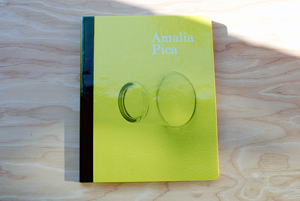
“In 1977, David King designed this logo for his friend’s zine cover and later that same friend’s band in Essex, England. This book playfully explores this iconic symbol and the mind of the man that created it.”

– from Secret Origins of the Crass Symbol, published in 2013 by & Pens Press. 

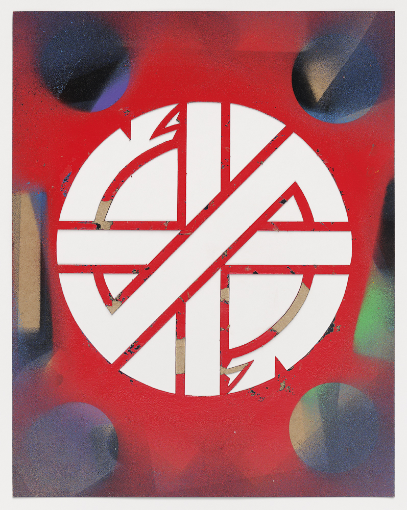
In the mid 2000s there was a brief controversy over the ownership and origins of the Crass symbol when a London fashion brand used it as part of a clothing line and then unsuccessfully tried to copyright it. David King (1948 – 2019) knew that over the years the symbol he designed had come to stand not only for the band Crass, but also for anarchy, peace, freedom, autonomy, DIY ethics, a rejection of church and state, a rejection of the system and, for some, a way of life. It was a symbol that could never be owned by anyone. It was designed to be easily reproduced, as evidenced by its proliferation on clothing, walls, badges, jewelry, human skin, the bottom of empty swimming pools, and almost any other surface that would take ink or spray paint. 

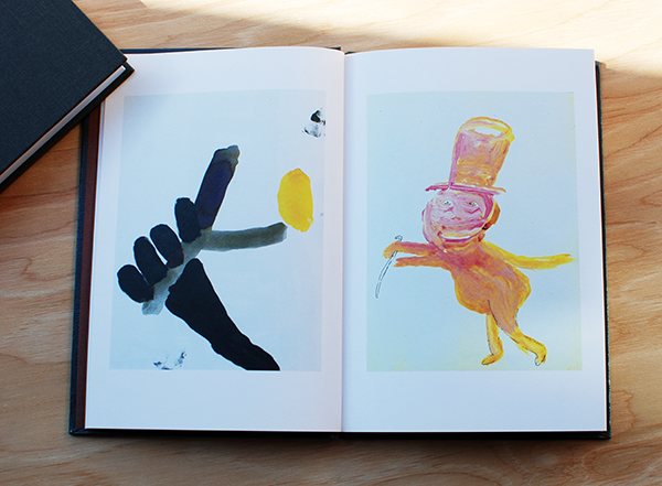
When faced with the suggestion of someone copyrighting or claiming ownership of his design, King decided to “free the symbol” with humor and color—qualities not always associated with anarcho-punk. His Secret Origins book and related projects expanded the notion of what the symbol could contain—including, but not limited to, wedges of cheese, extended serpents, the Batman logo, tea and coffee pots, smiley faces, the CND logo and more. Today reinterpretations and homages have appeared incorporating killer whales, rainbows and air dancers, to name a few. We know King would have loved these variations, and through them his idea continues to live on. 

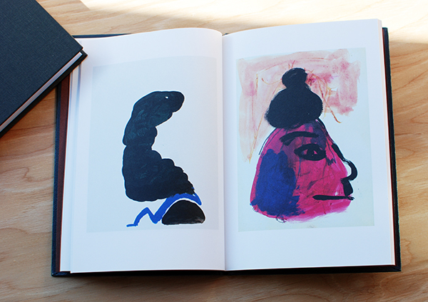
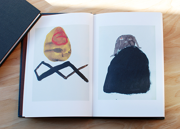
Return of Secret Origins of the Crass Symbol is an exhibition of King’s process. Alongside the hand-lettered ink drawing for the original book’s cover, there are five scalpel-cut stencils thick with layers of spray paint. These stencils were used not only by King, but also by visitors to 2011’s Spray Day at San Francisco’s Goteblüd gallery, where anyone could apply the designs to clothing, skateboards, toilet seats and anything else they could carry in. Many were later photographed for the book David King Stencils, published by Gingko Press in 2019. These stencils are the literal origins for many reproductions of the Crass symbol, and they offer a simple diagram for how it all began.

David Anthony King (1948 – 2019) was a British born American artist, graphic designer, and musician. He is best known for designing the Crass symbol in 1977. As part of the New York No Wave scene in the late 1970s he played in the bands Arsenal and the Gynaecologists, and later moved to San Francisco where he formed Sleeping Dogs and Brain Rust. He created design work for Danceteria, the Peppermint Lounge, the Museum of Modern Art in New York, Details magazine, and many others. In the 2000s he revisited and expanded his design for the Crass symbol through numerous exhibitions as well as producing dozens of self published books of photography and art. 

New & Pens Press title: What A Time To Be Alive by Joakim Ojanen

Joakim1

We are proud to present our newest title: What A Time To Be Alive by Joakim Ojanen – a full color, 60 page, perfect bound, glossy book published by & Pens Press in conjunction with Ojanen’s exhibition “New Paintings and Ceramic Work” at Richard Heller Gallery. Book available online and at our local LA annexes. *ONLY 300 MADE.

Joakim5
Joakim6
Joakim2
Joakim3
joakim7

Selected Press:
“Joakim Ojanen: Innocence and melancholy, sculpted into old souls and teary dogs” – LA TIMES
“5 Questions with Joakim Ojanen” – Elephant Magazine

Saturday = LOVE WARZ + ZARA THUSTRA + Special Guests

tumblr_mr3bwbenY01sdorg4o1_400
& PENS PRESS presents a book release for

XARA THUSTRA‘s
Friendship Between Artists
is an Equation of Love and Survival

with musical performances by

LOVE WARZ
(Xara Thustra collaboration with Siobhan Aluualot)
plus

SPECIAL GUESTS

SATURDAY, OCTOBER 5, 2013
7:30 – 9:30 p.m.

* * FREE FOOD * *

INFO:
Names like Barry McGee, Margaret Kilgallen, and Chris Johanson are credited as some of the key players in the San Francisco 1990’s art movement known as the “Mission School.” The history books teling the story of this art movement and bringing it into the mainstream have left behind a few artists that were and still are artistically trailblazing, often times alongside those that received greater acclaim.

The story of the “Mission School” is definitely not complete without XARA THUSTRA. Both an activist and artist, Thustra has been pushing the envelope socially and artistically for 15 plus years in San Francisco. Xara’s ever evolving creative medium has been graffiti, screen printed posters. calendars, murals, paintings, video, music, performance and protest. Socially, Xara has been responsible for anti-war actions, gay activism, feeding the hungry, anti-capitalist actions, squats like 949 Market, and so much more…

This beautiful 500 page book captures 15 plus years of Thustra’s work in one package through photos and imagery. Not to mention, there are also cameos contained within from Xylor Jane, Chris Johanson, Barry McGee, Emory Douglas, Erick Lyle, Kyle Ranson, Ivy Jean, Sy Loady, and a cast of other SF punks, artists, queers, and activists. Such fantastic stuff. Don’t miss this.

– – – – – – – – – – –

“Feed the people! SF STOPS WARS. STOP MEN. Hard-working, self-schooled, tireless artist/activist Xara Thustra [rules] 2-D, performance, drums, video. Manhaters, Love Warz AND the annual Calendar. HEART 101. All for FREE! Unbelievable.” – Xylor Jane

“Thustra’s art fills me with a crazy unhinged joy. It makes you want to do something joyful and spectacular and very illegal. I would like to think that my heart looks something like this, and yours too.” – Michelle Tea

“I have always been inspired by the creativity of Xara. It is always 100 percent care. One of my favorite artists that I met in SF. Making things to make people think and with so much concern. This book about creative ritual and meditation toward making things better is a good gesture in the Left direction. A non text book, but in the school of life.” – Chris Johanson

“Like an invisible giant, silently stalking our city, converting it’s ever-more-boring facade into an impassioned, beautiful call to arms, revolution, and to love. Xara has created an incredible genre and gender busting body of work. This is the freak flag flying high.” – Bill Daniel

This Sounds a Bit Like Goodbye

DSC_0248

This Sounds a bit like Goodbye
by Stefan Marx (Hamburg, Germany)

Stefan Marx‘s latest and greatest publication, This Sounds a bit Like Goodbye, is a continuation of his travel drawings of the people and places he visits.  

DSC_0253For this series New York was his host. 

DSC_0254 DSC_0255

Over the course of 156 pages paperback pocket-sized book, Stefan’s quick and gestural portraits depict shops, sceneries and funny impressions of  individuals. You can tell the energy of the characters are sometimes done in just a moment while others seem like he had time to sit and revel in the details of his surroundings a bit more.

DSC_0257 DSC_0256

This Sounds a bit like Goodbye is Stefan Marx’ 16th publication with Nieves. We are hoping he travels to LA for his next one. 

Available in the Bookstore here.

DSC_0251 DSC_0252

DSC_0249

Picturing Dreams with Bertrand Fleuret

Since we are a little belated with our blog posts from the holiday weekend we decided to combine Monday Meditations and Poetry Tuesday by introducing an inspiring and unique book that represents both worlds: The Cliffs by Bertrand Fleuret.

artbook_2272_268831874

French photographer Bertrand Fleuret, born in 1969, is a maker of beautifully produced photo books. The Cliffs, published by JL Books, continues the exploration of his earlier work in Landmasses and Railway’s by combining imagery and imaginary worlds, leading the viewer through surreal pathways with poetic narrations.

The inspiration behind The Cliffs was to reconstruct a vivid dream of Fleuret’s that began with him standing by a wall of dark cliffs. When he awoke from the dream he still found the imagery completely vidid and compelling even after being long awake. The collection of color images and written accounts of the dream reproduces the sequence of events he experienced both awake and asleep. 

Available here.

DSC_0259

DSC_0262“I am standing by a wall of dark cliffs. They form a circle of about 100 meters in diameter.”

DSC_0263 DSC_0264 DSC_0265 DSC_0266 DSC_0267 DSC_0268DSC_0270 DSC_0271

Monday Love: Jason Logan

Festus, by Canadian artist and illustrator Jason Logan, is another gem published by J&L Books that we are particularly stoked about having in the & Pens Press shop currently.

DSC_0225

Published in 2010, this handheld hardcover publication depicts the classic figure of the frontiersman in various incarnations.

DSC_0226

Logan made these works while traveling to the Klondike Institute in the outer reaches of Yukon, by the Alaska border.

DSC_0227

Loose, colorful and confident, these thirty-five variations on the frontiersman carry through the book in different forms as the hustler, magician and logger just to name a few. Feeling like a mixture of incantations and studies Logan’s characters feel simultaneously iconic and refreshing. He’s traveled in his own path and loving this work feels like rooting for the underdog. 

Available in the bookstore here. 

DSC_0228

Get to Know : Jonathan Chao

Please welcome our first featured artist on the blog Jonathan Chao from Oakland, California. 

Jon works at Ape Do Good Printing, an artist run commercial silkscreen printing shop in the Mission district of San Francisco, while also independently producing his own beautiful silkscreen zines and projects.  Curious to get to know more about his process, motivation and upcoming projects we asked Jon to tell us a bit more about himself. 

inside ape

&PP: To start, can you tell us about how you began making zines and doing what you do?

JC: I am a printmaker that makes art zines/books. The zines, notably Warm Up, are experiments with the screen printing medium and the book format.  My recent focus has been leaning towards abstraction with a focus on pattern work. I recently started screen printing and making art zines towards the end of 2012, but before that I was attending UC Santa Barbara for art. At Santa Barbara I was formally trained, but it wasn’t till the end of the school that I decided to pursue self-publication and focus more on printmaking. I recently picked up screen printing so I still feel pretty fresh to the medium, but at moment I have been thinking about creating film positives with analog means. As for art zines/books I am digging into the community and finding something I really enjoy; there’s so much there that it’s exciting to follow.

ape do good I spend a lot of time around screen printing so thinking about it in relation to my art is inevitable. 

ink rackI try to take notice of colors that catch my attention when I’m around the shop. This helps me produce some interesting color schemes.

books
Here are some of my favorite zines and books in my collection. My most recent favorite find was Lite Murk by Cody Hoyt, printed by Visual Field Press. That Letman: The Art and Lettering of Job Wouters and Fraktur Mon Amour are also such awesome books.

DSC_0237 &PP: We love your latest publication Warm Up, it’s beautiful. Care to walk us through your inspiration and process?

JC: The origin of Warm Up was a result of making mock ups for an 8 fold zine. It was with an old page covered with practice marks and strokes. I noticed how nice certain areas looked when focused from the full page. That event lead to the inspiration for the Warm Up series.

DSC_0239 As for the process of composing the image, I created each layer as I went along and the process came organically. I experimented with making film positives through analog means and observed how certain materials and marks reacted when burned on the screen. I was curious about the results.

DSC_0242When preparing for Warm No. 1, I worked things out in my head and made preliminary thumbnail sketches. I hoped for the best when I printed, but left myself open to uncertain results and reactions. It was a real surprise with every layer, because I was loose with registering the different layers.  Even more surprised was when I finished folding the finished print into an 8 fold zine. I thought it was interesting that I was working from a large image that would later on be turned into a series of smaller images. It was kind of a backwards way of working.  I recently realized, as the maker of Warm Up, I was working to find out what the larger image will turn into as it is folded. Whereas, the viewer is working his or her way from the small folded image into the large unfolded full image. I like that.

DSC_0241 DSC_0245DSC_0247
&PP: What are you working on right now or have coming up in the future that you are looking forward to?

JC: In the near future you can expect two more different Warm Up editions. They will both be within a similar style of Warm Up No. 1, but focusing on different techniques in making screen positives.  Then after the editions, I’ll dig through my sketchbook for the next project, which will most likely be some kind of print. My mind set has been geared towards screen printing since I’m around it so often. I’m excited to see what happens later.

&PP: Thanks for your time Jon, we look forward to seeing your new projects!

Friday Favorite : Amalia Pica

It’s Friday! This week’s Friday Favorite post is on an exhibition catalog by the incredible London- based Argentinian artist, Amalia Pica. We’ve been fans of Pica’s work for awhile so when we heard about this publication coming out we couldn’t wait to get our hands on it. 

DSC_0255

The book began with her first major solo museum show, Amalia Pica at the MCA, where approximately fifteen of her most significant works from the last seven years, in addition to new commissions, were exhibited in the United States for the first time.

DSC_0257Incorporating simple everyday objects and celebratory signifiers of celebration such as fiesta lights, flags and banners, confetti, rainbows, photocopies, lightbulbs, drinking glasses, beer bottles and cardboard Pica’s work is optimistic, colorful, poetic and beautiful.

Pica’s work is directly dealing with that the translation of symbolic language and motivated by how meaning is created and deciphered between the artist and the viewer. 

DSC_0258

With a similar creative energy curators João Ribas of MIT List Visual Arts Center, and Julie Rodrigues Widholm of the MCA came together to spearhead the publication with the goal of giving an in-depth look at the last ten years of Pica’s work. During this time Pica worked in close collaborative dialogue for the design and editorial process. The result is a strong visual and text based overview of her  drawings, sculptures, large-scale photographic prints, slide projections, live performances and installations.

DSC_0259

DSC_0260

With 112 colorful pages,  foldout sections, radius-cut board cover with foil-blocked buckram spine and a yellow transparent PVC dust jacket the publication exudes a high level of visual, conceptual and textural stimulation. The design feels synonymous with Pica’s work, and makes for an enjoyable way to experience Pica’s work. Even the transparent greenish-yellow PVC dust jacket mimics Pica’s use of coloured gels within her work.

All in all this is a fun, interesting publication, and a perfect overview for those interested in learning more about Pica’s work. Highly recommended. 

Available for $30 in the & Pens Press online store here.

DSC_0261DSC_0256

Amalia Pica
Project: Exhibition catalogue
Publisher: MCA Chicago, Artbook | DAP
Format: 203.2 × 254 mm (8 × 10 in)
112 pages with foldout sections
Radius-cut board cover with foil-blocked buckram spine, yellow transparent PVC dust jacket
Curators: João Ribas (MIT List), Julie Rodrigues Widholm (MCA Chicago)
Director of Publications: Kate Steinmann
Editors: Lisa Meyerowitz, Molly Zimmerman-Feeley
Designers: James Goggin, Scott Reinhard
Printing: Die Keure, Bruges

The Timeless Interaction of Color

Josef Albers, the German-born artist and educator who taught at the Bauhaus, Black Mountain College and Yale University created Interaction of Color as a handbook and teaching aid for artists, instructors, and students.

For those who have experience with this book (by teaching from or learning from it) knows it is a timeless and mesmerizing resource for anyone interested in color theory and human perception. 

DSC_0227

Originally published by Yale University Press in 1963 as a limited silkscreen edition with 150 color plates, Interaction of Color first appeared in paperback in 1971, featuring ten color studies chosen by Albers, and has remained in print ever since.

With over a quarter of a million copies sold in its various editions since 1963, Interaction of Color has become a watershed on complex color theory principles and is as pioneering today as when Albers first created it.

DSC_0230

DSC_0231 DSC_0232 DSC_0233

Fifty years after Interaction of Colors’s initial publication, this new edition presents an expanded selection of close to sixty color studies alongside Albers’s original text, demonstrating such principles as color relativity, intensity, and temperature; vibrating and vanishing boundaries; and the illusion of transparency and reversed grounds.

DSC_0234  DSC_0236

To further celebrate the book’s 50th anniversary Yale University Press also released  a new way to engage with Albers’s lessons by releasing the “Interaction of Color” App for the iPad.

josef-albers-3-thumb-307x387-65189josef-albers-2-thumb-307x387-65191

The ($9.99) app combines the book’s text and color studies, video commentary, interviews and over 60 new interactive plates that enables users to try their own color experiments with color. 

While we strongly believe there is something essential to holding publications in your hand, feeling the stock and tooth of paper and seeing colors in changing light, this app is an exciting way for Alber’s teachings to reach new audiences in studios and classrooms and that we are unquestionably in favor for that. 

Purchase Interaction of Color by Josef Albers here
Visit the Yale Books website for more info on the Interaction of Color App.